|
Quantile-Quantile (q-q) Plots
Author(s)
David Scott
Prerequisites
Histograms, Distributions, Percentiles, Describing
Bivariate Data, Normal Distributions
Learning Objectives
- State what q-q plots are used for.
- Describe the shape of a q-q plot when the distributional assumption is met.
- Be able to create a normal q-q plot.
Introduction
The quantile-quantile or q-q plot is an exploratory graphical
device used to check the validity of a distributional assumption
for a data set. In general, the basic idea is to compute the
theoretically expected value for each data point based on the
distribution in question. If the data indeed follow the assumed
distribution, then the points on the q-q plot will fall approximately
on a straight line.
Before delving into the details of q-q plots, we
first describe two related graphical methods for assessing distributional
assumptions: the histogram and the cumulative distribution function
(CDF). As will be seen, q-q plots are more general than these
alternatives.
Assessing Distributional Assumptions
As an example, consider data measured from a physical device such
as the spinner depicted in Figure 1. The red arrow is spun around
the center, and when the arrow stops spinning, the number between
0 and 1 is recorded. Can we determine if the spinner is fair?
If the spinner is fair, then these numbers should follow a uniform
distribution. To investigate whether the spinner is fair, spin
the arrow n times, and record the measurements by {μ1, μ2,
..., μn}.
In this example, we collect n = 100 samples. The histogram provides
a useful visualization of these data. In Figure 2, we display
three different
histograms on a probability scale. The
histogram should be flat for a uniform sample, but the visual
perception varies depending on whether the histogram has 10, 5,
or 3 bins. The last histogram looks flat, but the other
two histograms are not obviously flat. It is not clear which
histogram we should base our conclusion on.
Alternatively, we might use the cumulative distribution
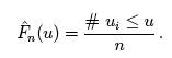
function (CDF), which is denoted by F(μ). The CDF gives the
probability that the spinner gives a value less than or equal
to μ, that is, the probability that the red arrow lands in
the interval [0, μ]. By simple arithmetic, F(μ) = μ,
which is the diagonal straight line y = x. The CDF based upon
the sample data is called the empirical CDF (ECDF), is denoted
by  ,
and is defined to be the fraction of the data less than or equal to
μ; that is, ,
and is defined to be the fraction of the data less than or equal to
μ; that is,
In general, the ECDF takes on a ragged staircase appearance.
For the spinner sample analyzed in Figure 2, we computed the ECDF
and CDF, which are displayed in Figure 3. In the left frame, the
ECDF appears close to the line y = x, shown in the middle frame.
In the right frame, we overlay these two curves and verify that
they are indeed quite close to each other. Observe that we do
not need to specify the number of bins as with the histogram.
q-q plot for uniform data
The q-q plot for uniform data is very similar to the empirical
CDF graphic, except with the axes reversed. The q-q plot provides
a visual comparison of the sample quantiles to the corresponding
theoretical quantiles. In general, if the points in a q-q plot
depart from a straight line, then the assumed distribution is
called into question.
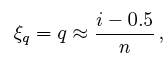
Here we define the qth quantile of a batch of n numbers
as a number ξq
such that a fraction q x n of the sample is less than ξq,
while a fraction (1 - q) x n of the sample is greater than ξq.
The best known quantile is the median, ξ0.5, which
is located in the middle of the sample.
Consider a small sample of 5 numbers from the spinner:
μ1 = 0.41, μ2 =0.24, μ3 =0.59,
μ4 =0.03,and μ5 =0.67.
Based upon our description of the spinner, we expect a uniform
distribution to model these data. If the sample data were “perfect,” then
on average there would be an observation in the middle of each
of the 5 intervals: 0 to .2, .2 to .4, .4 to .6, and so on. Table
1 shows the 5 data points (sorted in ascending order) and the
theoretically expected value of each based on the assumption
that the distribution is uniform (the middle of the interval).
Table 1. Computing
the Expected Quantile Values.
|
Data (μ)
|
Rank (i)
|
Middle of the
ith Interval
|
.03
.24
.41
.59
.67 |
1
2
3
4
5
|
.1
.3
.5
.7
.9
|
The theoretical and empirical CDFs are shown in
Figure 4 and the q-q plot is shown in the left frame of Figure
5.
In general, we consider the full set of sample quantiles to be
the sorted data values
μ(1) < μ(2) < μ(3) < ··· < μ(n-1) < μ(n)
,
where the parentheses in the subscript indicate
the data have been ordered. Roughly speaking, we expect the first
ordered value to be in the middle of the interval (0, 1/n), the
second to be in the middle of the interval (1/n, 2/n), and the last to be in
the middle of the interval ((n - 1)/n, 1). Thus, we take as the
theoretical quantile the value
where q corresponds to the ith ordered sample
value. We subtract the quantity 0.5 so that we are exactly
in the middle of the interval ((i - 1)/n, i/n). These ideas are
depicted in the right frame of Figure 4 for our small sample of
size n = 5.
We are now prepared to define the q-q plot precisely.
First, we compute the n expected values of the data, which we
pair with the n data points sorted in ascending order. For the
uniform density, the q-q plot is composed of the n ordered pairs
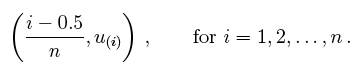
This definition is slightly different from the ECDF, which
includes the points (u(i), i/n). In the left frame of Figure 5,
we display the q-q plot of the 5 points in Table 1. In the right
two frames of Figure 5, we display the q-q plot of the same batch
of numbers used in Figure 2. In the final frame, we add the
diagonal line y = x as a point of reference.
The sample size should be taken into account when judging how
close the q-q plot is to the straight line. We show two other
uniform samples of size n = 10 and n = 1000 in Figure 6. Observe
that the q-q plot when n = 1000 is almost identical to the line
y = x, while such is not the case when the sample size is only
n = 10.
In Figure 7, we show
the q-q plots of two random samples that are not uniform. In
both examples, the sample quantiles match the theoretical quantiles
only at the median and at the extremes. Both samples seem to be
symmetric around the median. But the data in the left frame are
closer to the median than would be expected if the data were uniform.
The data in the right frame are further from the median than would
be expected if the data were uniform.
In fact, the data were generated in the R language from beta distributions
with parameters a = b = 3 on the left and a = b =0.4 on the right.
In Figure 8 we display histograms of these two data sets, which
serve to clarify the true shapes of the densities. These are clearly
non-uniform.
q-q plot for normal data
The definition of the q-q plot may be extended
to any continuous density. The q-q plot will be close to a straight
line if the assumed density is correct. Because the cumulative
distribution function of the uniform density was a straight line,
the q-q plot was very easy to construct. For data that are not
uniform, the theoretical quantiles must be computed in a different
manner.
Let {z1, z2, ..., zn} denote
a random sample from a normal distribution
with mean μ = 0 and standard deviation σ = 1. Let
the ordered values be
denoted by
z{1) < z(2) < z(3) < ...
< z(n-1) <z(n).
These n ordered values will play the role of the sample quantiles.
Let us consider a sample of 5 values from a distribution
to see how they compare with what would be expected for a normal
distribution. The 5 values in ascending order are shown in
the first
column of Table 2.
Table 2. Computing
the expected quantile values for normal data.
|
Data (z)
|
Rank (i)
|
Middle of the
ith Interval
|
Normal (z) |
-1.96
-.78
.31
1.15
1.62
|
1
2
3
4
5
|
.1
.3
.5
.7
.9
|
-1.28
-0.52
0.00
0.52
1.28 |
Just as in the case of the uniform distribution,
we have 5 intervals. However, with a normal distribution the
theoretical quantile is not the middle of the interval but rather the
inverse of the normal distribution for the middle of the interval. Taking the
first interval as an example, we want to know the z value such
that 0.1 of the area in the normal distribution is below z. This
can be computed using the Inverse Normal Calculator as shown in
Figure 9. Simply set the “Shaded Area” field to
the middle of the interval (0.1) and click on the “Below” button.
The result is -1.28. Therefore, 10% of the distribution is below
a z value of -1.28.
The q-q plot for the data in Table 2 is shown
in the left frame of Figure 11.
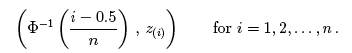
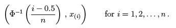
In general, what should we take as the corresponding
theoretical quantiles? Let the cumulative distribution function
of the normal density be denoted by Φ(z). In the previous
example, Φ(-1.28) = 0.10 and Φ(0.00) =
0.50. Using the quantile notation, if ξq is the qth quantile
of a normal distribution, then
Φ(ξq)= q.
That is, the probability a normal sample is less
than ξq is in fact just q.
Consider the first ordered value, z(1).
What might we expect the value of Φ(z(1)) to
be? Intuitively, we expect this probability to take on a value
in the interval (0, 1/n). Likewise, we expect Φ(z(2)) to
take on a value in the interval (1/n, 2/n). Continuing, we expect Φ(z(n)) to
fall in the interval ((n - 1)/n, 1). Thus, the theoretical quantile
we desire is defined by the
inverse (not reciprocal) of the normal CDF. In particular, the
theoretical quantile corresponding to the empirical quantile z(i)
should be
for i = 1, 2, ..., n.
The empirical CDF and theoretical quantile construction
for the small sample given in Table 2 are displayed in Figure 10.
For the larger sample of size 100, the first few expected
quantiles are -2.576, -2.170, and -1.960.
In the left frame of Figure 11, we display the q-q
plot of the small normal sample given in Table 2. The remaining frames
in Figure 11 display the q-q plots of normal random samples of
size n = 100 and n = 1000. As the sample size increases, the points
in the q-q plots lie closer to the line y = x.
As before, a normal q-q plot can indicate departures
from normality. The two most common examples are skewed data and
data with heavy tails (large kurtosis). In Figure 12, we show normal
q-q plots for a chi-squared (skewed) data set and a Student’s-t
(kurtotic) data set, both of size n = 1000. The data were first
standardized. The red line is again y = x. Notice, in particular,
that the data from the t distribution follow the normal curve
fairly closely until the last dozen or so points on each extreme.
q-q plots for normal data with general mean and
scale
Our previous discussion of q-q plots for normal
data all assumed that our data were standardized. One approach
to constructing q-q plots is to first standardize the data and
then proceed as described previously. An alternative is to construct
the plot directly from raw data.
In this section, we present a
general approach for data that are not standardized. Why did we
standardize the data in Figure 12? The q-q plot is comprised of
the n points
If the original data {zi} are normal, but have
an arbitrary mean μ and
standard deviation σ, then the line y = x will not
match the expected theoretical quantiles. Clearly, the linear transformation
μ + σ ξq
would provide the qth theoretical quantile on
the transformed scale. In practice, with a new data set
{x1,x2,...,xn}
,
the normal q-q plot would consist of the n points
Instead of plotting the line y = x as a reference
line, the line
y = M + s · x
should be composed, where M and s are the sample
moments (mean and standard deviation) corresponding to the theoretical
moments μ and σ.
Alternatively, if the data are standardized, then the line y =
x would be appropriate, since now the sample mean would be 0 and
the sample standard deviation would be 1.
Example: SAT Case Study
The SAT case study
followed the academic achievements of 105 college students
majoring in computer science. The first
variable is their verbal SAT score and the second is their grade
point average (GPA) at the university level. Before we compute
inferential statistics using these variables, we should check
if their distributions are normal. In
Figure 13, we display the q-q plots of the verbal SAT and university
GPA variables.
The verbal SAT seems to follow a normal distribution
reasonably well, except in the extreme tails. However, the university
GPA variable is highly non-normal. Compare the GPA q-q plot to
the simulation in the right frame of Figure 7. These figures are
very similar, except for the region where x ≈ -1. To follow
these ideas, we computed histograms of the variables and their
scatter diagram in Figure 14. These figures tell quite a different
story. The university GPA is bimodal, with about 20% of the students
falling into a separate cluster with a grade of C. The scatter
diagram is quite unusual. While the students in this cluster all
have below average verbal SAT scores, there are as many students
with low SAT scores whose GPAs were quite respectable.
We might speculate as to the cause(s): different distractions,
different
study habits, but it would only be speculation. But observe that
the raw correlation between verbal SAT and GPA is a rather high
0.65, but when we exclude the cluster, the correlation for the
remaining 86 students falls a little to 0.59.
Discussion
Parametric modeling usually involves making assumptions
about the shape of data, or the shape of residuals from a regression
fit. Verifying such assumptions can take many forms, but
an exploration of the shape using histograms and q-q plots is
very effective. The q-q plot does not have any design parameters
such as the number of bins for a histogram.
In an advanced treatment,
the q-q plot can be used to formally test the null hypothesis
that the data are normal. This is done by computing the correlation
coefficient of the n points in the
q-q plot. Depending upon n, the null hypothesis is rejected if
the correlation coefficient is less than a threshold. The threshold
is already quite close to 0.95 for modest sample sizes.
We have seen that the q-q plot for uniform data
is very closely related to the empirical cumulative distribution
function. For general density functions, the so-called probability
integral transform takes a random variable X and maps it to the
interval (0, 1) through the CDF of X itself, that is,
Y = FX(X)
which has been shown to be a uniform density. This
explains why the q-q plot on standardized data is always close
to the line y = x when the model is correct.
Finally, scientists have used special graph paper for years to
make relationships linear (straight lines). The most common
example used to be semi-log paper, on which points following the
formula y = aebx appear linear. This follows of course since
log(y) = log(a) + bx, which is the equation for a straight line.
The q-q plots may be thought of as being “probability graph
paper” that makes a plot of the ordered data values into
a straight line. Every density has its own special probability
graph paper.
Please answer the questions:
|