|
Descriptive Statistics
Box plots
When comparing two or more groups, it is generally a
good idea to start by creating some form of side-by-side
box plots or
quantile plots. These plots reveal important information
about the location, spread, and shape of the distribution of
scores in each group.
The plot shows pain ratings of subjects treated with
active magnets (Treatment) and those treated with inactive
placebo devices (Control).
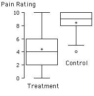
What is the mean for the group treated with active
magnets?
9
Just over 8
Just over 4
4

The lowest pain rating of the control group appears to be
equal to:
The mean of the treatment group
The median of the treatment group
The highest score in the treatment
group
Overall, the group in the most pain is the
control group
treatment group
The middle 50% of the scores for the control group fall
between:
2-6
5-10
8-10
0-10
The circle represents:
An outlier
A score not included in the
calculations
A score which did not fit in the
treatment group
The histograms shown below provide more details about
the shapes of the distributions. The Y axis labeled density is equal
to the frequency divided by the sample size. For the treatment group,
4 out of 29 subjects rated their level of pain as 0. Therefore the density
for the first bar is 4/29 = 0.14.
The red curve in the distribution shows what a normal
distribution with the same mean and variance as the data
would look like.

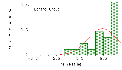
The post-treatment scores for the placebo (control)
group:
Have a positive skew
Are leptokurtic
Are platykurtic
Have a negative skew
Basic descriptive statistics are shown below.
What was the range for the group that received the active
magnets?
8.43
6
4.38
10
The pain ratings are more variable in
The treatment condition
The placebo (control) condition
|